Creative My Art Gallery.
- Thread starter D I O
- Start date
More options
Who Replied?


- Messages
- 23
- Reaction score
- 106
- Points
- 785
- Salty Doubloons
- 0
Thank you for your feedback.I'm not into drawing myself but i do like the second a lot
As for suggestions i can't give you any cause i am shit at drawing

- Messages
- 5,349
- Reaction score
- 21,907
- Points
- 16,150
- Salty Doubloons
- 2,479
What did you use to make these?These are some of my artwork, as i want to enhance my skills within concept art designs.

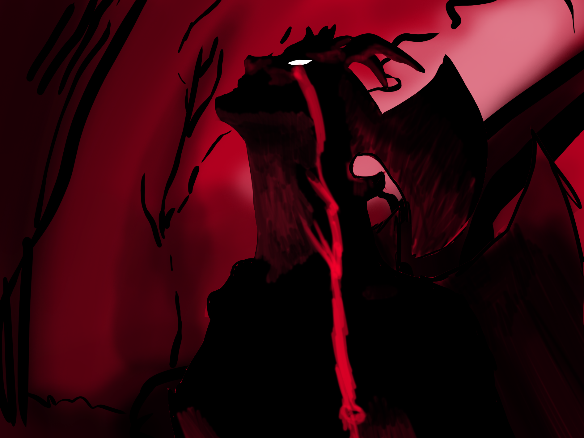
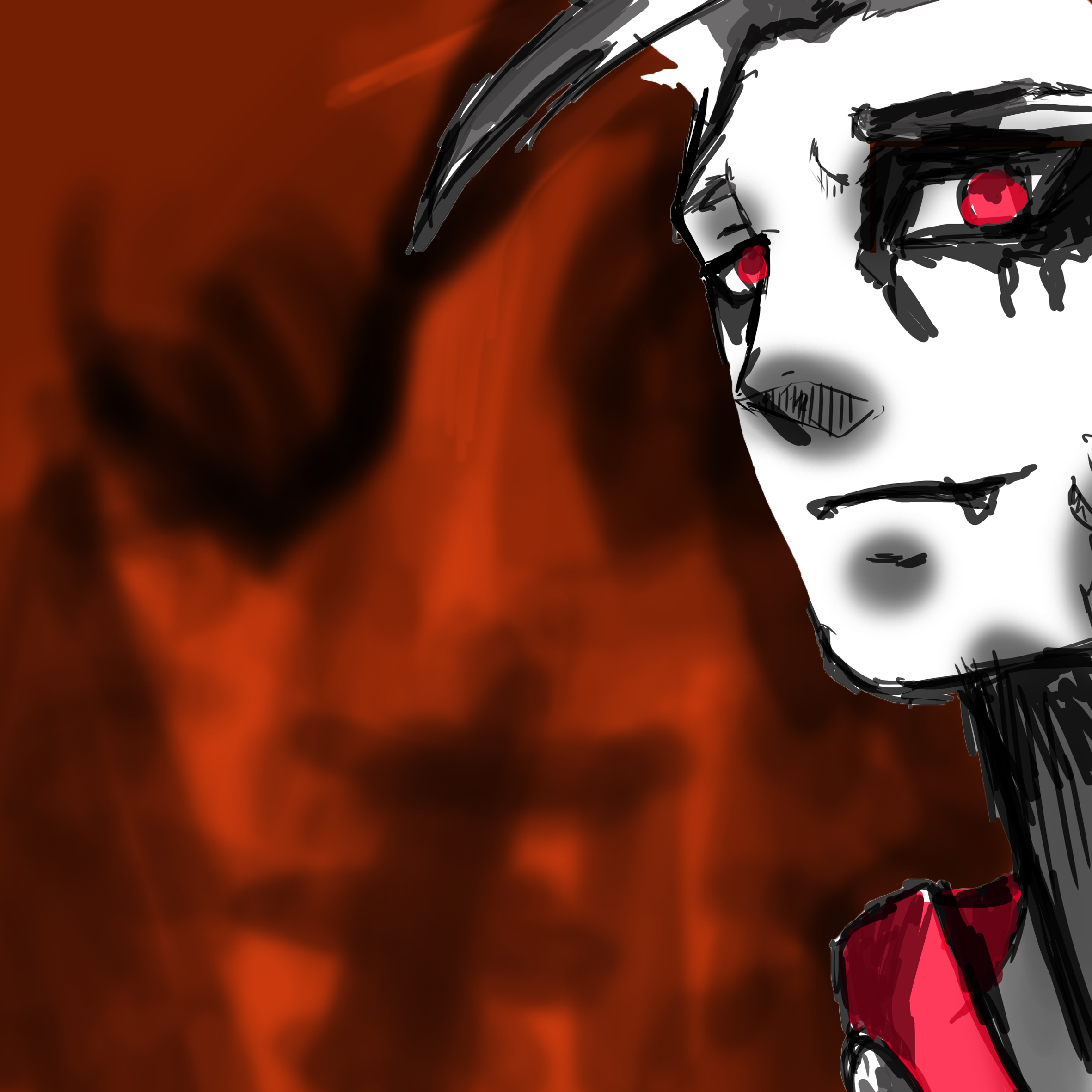

Fyi ; this is my first time drawing, could i please get any critiques and suggestions please, thanks
Regards,
Dio
- Messages
- 23
- Reaction score
- 106
- Points
- 785
- Salty Doubloons
- 0
I used Photoshop to make these.What did you use to make these?
- Messages
- 5,349
- Reaction score
- 21,907
- Points
- 16,150
- Salty Doubloons
- 2,479
Oh... I think for the first time its turn out pretty good though if you want to refine your sketch skills then, in my opinion, you shouldn't really care about these background coloring for a while and just focus on a sketch and try to improve your skills one by one like creating hand, fingers, eyes from different angle.I used Photoshop to make these.
Though for the first time it really did turn out pretty well.
- Messages
- 23
- Reaction score
- 106
- Points
- 785
- Salty Doubloons
- 0
Thank you very much for your feedback, I'd take your recommendation on board for future work.Oh... I think for the first time its turn out pretty good though if you want to refine your sketch skills then, in my opinion, you shouldn't really care about these background coloring for a while and just focus on a sketch and try to improve your skills one by one like creating hand, fingers, eyes from different angle.
Though for the first time it really did turn out pretty well.

- Messages
- 317
- Reaction score
- 2,520
- Points
- 3,050
- Salty Doubloons
- 1,801
Heyo, me being a fellow artist, I can try to give some feedback!!!
I think your ideas are already pretty cool! I really like the concept of the first and second one.
I can definitely say that there is a lot of room for improvement regarding colors and cleaner work (you lines are really sketchy and unclean). The second one has a good color concept though. Taking a look into color theory and check out which colors could fit are a good start. That is important because colors portray emotions and and atmosphere and depending on how they are being used they can set the mood for a piece. I can see that you're working with quite saturated colors, but don't be shy to use a broader range of color! (Mentioning it because of the Zoro art)
Something I also notice is you blurring a lot. For backgrounds to put focus on the characters = sure! I remember blurring a lot or using the airbrush tool a lot when I just started digital art. But shadows are not always blurred, that only counts for soft light. Mostly shadows are more refined.
Also: black is not the only color to use for dark spaces. This might just be me because I try to avoid black when drawing, but it is the absolute dark in a piece, so people mostly try to either give very strong contrasts with it or reduce it to only the lineart.
Sorry if that's a bit much but that's the basics I can say.
Oreki is right though, learning basic skills is important, also in terms of anatomy, though it is a very good start and I think you did really well for someone who isn't acquainted with drawing art much!
Do you have a graphic tablet?
I think your ideas are already pretty cool! I really like the concept of the first and second one.
I can definitely say that there is a lot of room for improvement regarding colors and cleaner work (you lines are really sketchy and unclean). The second one has a good color concept though. Taking a look into color theory and check out which colors could fit are a good start.
That is important because colors portray emotions and and atmosphere and depending on how they are being used they can set the mood for a piece. I can see that you're working with quite saturated colors, but don't be shy to use a broader range of color! (Mentioning it because of the Zoro art)Something I also notice is you blurring a lot. For backgrounds to put focus on the characters = sure! I remember blurring a lot or using the airbrush tool a lot when I just started digital art. But shadows are not always blurred, that only counts for soft light. Mostly shadows are more refined.
Also: black is not the only color to use for dark spaces. This might just be me because I try to avoid black when drawing, but it is the absolute dark in a piece, so people mostly try to either give very strong contrasts with it or reduce it to only the lineart.
Sorry if that's a bit much but that's the basics I can say.
Oreki is right though, learning basic skills is important, also in terms of anatomy, though it is a very good start and I think you did really well for someone who isn't acquainted with drawing art much!
Do you have a graphic tablet?
- Messages
- 23
- Reaction score
- 106
- Points
- 785
- Salty Doubloons
- 0
Thank you for your constructive feedback, as I'm only in the beginning stages of using the graphics tablet. This thread will help me develop my skills further, as i know it's a long journey. I will take on board your recommendations and suggestions, I will try to use different variations of colours without using black often.Heyo, me being a fellow artist, I can try to give some feedback!!!
I think your ideas are already pretty cool! I really like the concept of the first and second one.
I can definitely say that there is a lot of room for improvement regarding colors and cleaner work (you lines are really sketchy and unclean). The second one has a good color concept though. Taking a look into color theory and check out which colors could fit are a good start.
Something I also notice is you blurring a lot. For backgrounds to put focus on the characters = sure! I remember blurring a lot or using the airbrush tool a lot when I just started digital art. But shadows are not always blurred, that only counts for soft light. Mostly shadows are more refined.
Also: black is not the only color to use for dark spaces. This might just be me because I try to avoid black when drawing, but it is the absolute dark in a piece, so people mostly try to either give very strong contrasts with it or reduce it to only the lineart.
Sorry if that's a bit much but that's the basics I can say.
Oreki is right though, learning basic skills is important, also in terms of anatomy, though it is a very good start and I think you did really well for someone who isn't acquainted with drawing art much!
Do you have a graphic tablet?
I appreciate the feedback very much, and would be looking to improve my skills. The transition over to the graphics tablet is still new to me.
- Messages
- 317
- Reaction score
- 2,520
- Points
- 3,050
- Salty Doubloons
- 1,801
I quick made a small graphic with my art:Thank you for your constructive feedback, as I'm only in the beginning stages of using the graphics tablet. This thread will help me develop my skills further, as i know it's a long journey. I will take on board your recommendations and suggestions, I will try to use different variations of colours without using black often.
I appreciate the feedback very much, and would be looking to improve my skills. The transition over to the graphics tablet is still new to me.

I picked different colors from my art, so you can see the saturation and hues. It's just so you can see clearer that the colors look saturated and pleasing to the eye while not hitting the top saturation! (Though a few of the picked colors have a strong saturation). You're free to pick those colors from the graphics to check the values in Photoshop on the color wheel.
Additionally, that might be something for someone who's a bit more used to digital art, but filters and effects are what I use often
 (in Photoshop you can find them in the layer settings!) In general the Multiply effect is commonly used for shading, and the Luminosity Effect for setting stronger lights. (Use extra layers for shading in that case, not your main color layers when using the effects).
I am adding this one though because Multiply is super popular for digital artists and a huge help. And to say that I definitely didn't work with the colors I picked from my arts just like that, but I used a couple of different effects to set light and shadow to set the mood of the artwork until it looks harmonizing and pleasing to the eye.
- Messages
- 23
- Reaction score
- 106
- Points
- 785
- Salty Doubloons
- 0
I really like the way you delivered your work as it's eye appealing. I see I have a lot of work to do and to get on your level. What other graphic tools that you suggest that i can use within my work?I quick made a small graphic with my art:
I picked different colors from my art, so you can see the saturation and hues. It's just so you can see clearer that the colors look saturated and pleasing to the eye while not hitting the top saturation! (Though a few of the picked colors have a strong saturation). You're free to pick those colors from the graphics to check the values in Photoshop on the color wheel.
Additionally, that might be something for someone who's a bit more used to digital art, but filters and effects are what I use often
I am adding this one though because Multiply is super popular for digital artists and a huge help. And to say that I definitely didn't work with the colors I picked from my arts just like that, but I used a couple of different effects to set light and shadow to set the mood of the artwork until it looks harmonizing and pleasing to the eye.
Thank you for your recommendations and suggestions, I see I have a lot of improvements to validate in my work upon using different techniques and tools.
- Messages
- 317
- Reaction score
- 2,520
- Points
- 3,050
- Salty Doubloons
- 1,801
Take your time with it, and please don't compare yourself to the many artists out there. I am still only a small amateur. And I learned years over years! It takes a lot of practice and patience. My biggest improvements in colors also just happened last year, before I had huge troubles with it. It's okay to feel inspired or learn from others though!I really like the way you delivered your work as it's eye appealing. I see I have a lot of work to do and to get on your level. What other graphic tools that you suggest that i can use within my work?
Thank you for your recommendations and suggestions, I see I have a lot of improvements to validate in my work upon using different techniques and tools.
Tools are difficult to recommend. Working with layers is a big help though (sketch layer, lineart layer, color layers (those I for example put into a folder so it is cleaner and more organized). Two layer tools are also the transparency option, so you can color within your already colored area of a layer without drawing over it (it's this sort of grid in the options in the layer menu) as well as Opacity. Also clipping layers helps a lot. I don't know where to find the option in Photoshop though. Should be somewhere in the layer menu though.
It takes time to explore the options and possible brushes and tools of any program, so feel free to just look through all the tools and brushes available. You can also always download free custom brushes from the internet (pay attention that they are really for Photoshop though).
Another tip for learning and improving I like to mention here and there as well: Observe your surroundings and how things work. Perspective, objects and anatomy. Take a look at your hand and think about what you see besides a palm and 5 fingers. And it is often also helpful to break things down into simple shapes. If you don't know how to draw something, there's also lots of tutorials online that help you.
- Messages
- 23
- Reaction score
- 106
- Points
- 785
- Salty Doubloons
- 0
Thanks alot.Take your time with it, and please don't compare yourself to the many artists out there. I am still only a small amateur. And I learned years over years! It takes a lot of practice and patience. My biggest improvements in colors also just happened last year, before I had huge troubles with it. It's okay to feel inspired or learn from others though!
Tools are difficult to recommend. Working with layers is a big help though (sketch layer, lineart layer, color layers (those I for example put into a folder so it is cleaner and more organized). Two layer tools are also the transparency option, so you can color within your already colored area of a layer without drawing over it (it's this sort of grid in the options in the layer menu) as well as Opacity. Also clipping layers helps a lot. I don't know where to find the option in Photoshop though. Should be somewhere in the layer menu though.
It takes time to explore the options and possible brushes and tools of any program, so feel free to just look through all the tools and brushes available. You can also always download free custom brushes from the internet (pay attention that they are really for Photoshop though).
Another tip for learning and improving I like to mention here and there as well: Observe your surroundings and how things work. Perspective, objects and anatomy. Take a look at your hand and think about what you see besides a palm and 5 fingers. And it is often also helpful to break things down into simple shapes. If you don't know how to draw something, there's also lots of tutorials online that help you.